I want to know the communities opinion on the new flag and new logos.
Thoughts on the new flag
I like the old one better
I like the new one better
The new one does not represent Firestone like the old one did
Neutral
0voters
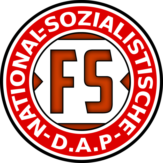
Thoughts on the new logos
I like the old one better
I like the new one better
The new ones don’t represent Firestone like the old ones did
Neutral
0voters
In my opinion, I think the changes of the flag and the logos where un-needed in the current state of the group. The logo’s are too different and do not fit the style of V2. The logo’s and flag should of been held on and used for V3, instead of just pushing them out as soon as they where finished. I do not think the logo’s and the flag represent what Firestone is at all.
The logos are nice but the flag is atrocious. Like it’s a nice design but the specifications fed gave seem dictatorial in both a literal and metaphorical sense. Although I won’t be surprised if in 6-12 months it just becomes normal.
DUDE AND HERES THE THING WHY THE FUCK ARE PEOPLE OFFENDED AT SWASTIKAS BUT NOT THE SOVIET UNION HAMMER AND SICKEL??? STALIN KILLED MILLIONS AS DID HITLER, BUT THE SWASTIKA IS TABOO AND THE HAMMER AND SICKLE IS FUNNY??? BOTH SHOULD BE EQUALLY FUNNY THIS IS RIDICULOUS